.

.

.
Showing posts with label words. Show all posts

Monday, September 21, 2015

my new blog

It has been a bit quiet here. I have a new blog and home on the net. Hope to see you there!


Hugs and kisses!


Tuesday, April 21, 2015

giveaway - astrid print


You can win a print with words by the fantastic Astrid Lindgren. Here is how you enter:
One ticket - comment on this post (remember to say how many tickets you´re praticipating with)!
Two tickets - share the giveaway on your blog, on facebook or Instagram (@fialottajanssondesign).
Three tickets - like Fia Lotta Jansson Facebook page.

Giveaway ends April 26th. Hope you want to join!

You can still pre-order the print by emailing med at fialottajansson at gmail dot com.
The print is size A3, the price is 250 SEK (26€), shipping included within the Nordic countries. If you live outside the Nordic countries please ask us for shipping prices!

Have a great week!


Friday, April 17, 2015

Astrid Lindgren print (förhandsbeställning)


Jag är överväldigad över den fina responsen och stora efterfrågan på denna bokstavsillustration med Astrid Lindgrens fantastiska ord! Nu trycker jag upp den igen! Vill du ha en print i A3-storlek maila mig på fialottajansson at gmail dot com och säg antal och adress. Den kostar 250 SEK (26€) inklusive porto inom Norden. Jag tar emot beställningar senast söndag 26 april!

Puss och kram och ha en skön helg!


Wednesday, April 8, 2015

glory - free downloadable print

I thought I'd treat you with a free download:


Click this link to download an A4 size file to print at home. The word Glory is written with a brush pen thus the beautiful brush stroke effect on the letters.

I hope you take the time to read this info on downloadable art:


All the best!


Monday, March 16, 2015

the words of dear astrid


I have a huge weakness for Astrid Lindgren, and I am not the only one. In June I lettered a quote by the world famous author of children's books, as a gift for our wonderful kindergarten personnel. It says: "Show the children love, more love and even more love and common sense will come by itself". It was not meant as an advice, because these women and men know this by heart, but more as an encouragement to keep up their great work. I am very thankful for the personnel at our kindergarten!

I printed this one in a limited first edition, but many have asked for it, so I am thinking of printing round two. Stay tuned! (And if you are interested in a print don't hesitate to ask via fialottajansson[at]gmail[dot]com!)

I wish you all a great week!
S


Tuesday, October 21, 2014

lettering workshop in stockholm november 18th


I am happy to announce that our Lettering Workshop together with Vintagefabriken will be held on November 18th at 6 o'clock in the evening. For four hours we will learn some basics in lettering, play and draw our way to fun and beautiful letters and go home with something useful!

The seats are limited so be sure to sign up (click here to go directly to registration)! You'll also find more info (in Swedish) via the link.


Wednesday, October 8, 2014

calligraphy for the Jakobsson family


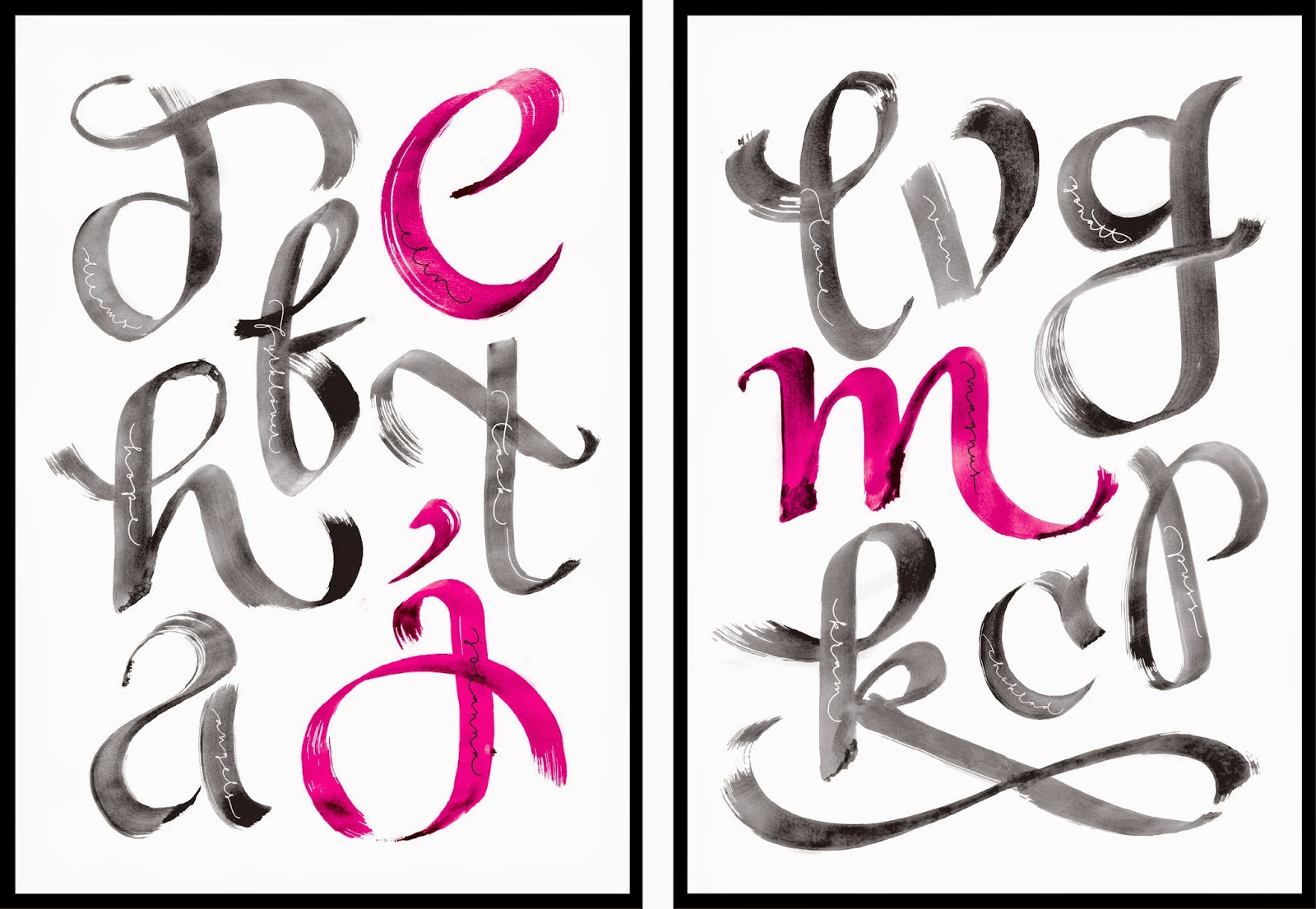
This fall I got to design my biggest lettering to date. Two prints measuring 70 cm x 100 cm each of calligraphy letters and words. I really enjoyed this commission work. I got to deliever the prints in person and they hung them up right away. Both customer and designer were very happy with the result. It was a perfect match of style and meaning behind the design.

The calligraphy letter is the first letter in the word written inside the letter (click on the pic and zoom in all you can!). The words have special meaning to the members of the family.

I painted the letters with a foam brush and because the prints are so large scale you can see the details of the strokes really well and I think it is very beautiful.


Here are some pictures from the livingroom where the prints are residing (thank you Jakobsson family for the pictures!).


This was a great project! I hope I get to do more of this kind.

All the best!


Monday, September 1, 2014

designing a logo: STHLM SONGS


There is a new record label in town, Sthlm Songs, and it is run by my husband Petter Näse and his business partner Markus "Black" Sjöberg.  I was happy to help them with the logo. Here is my process in designing a logo.

1. Research
I try to get a good feeling and knowledge of what the client want in a logo. I ask for guidelines, pictures or any reference that can give me an understanding of what they want aesthetically. I also ask questions about company values, thoughts and what message they want to come across to their audience. This way I can come up with a good result already at the sketching stage. Having a good dialog with the client is very important.

2. Sketching - the initial stage
I spend a good hour brainstorming and sketching a variety of logo designs. Trying not to be too critical at this stage.

When I am done sketching I choose the best ones, most often 3 to 8 designs, depending on the project, and show the client. These are the initial sketches for Sthlm Songs:


Early in the project they liked the ones with serif capitals on the right. They had come across some of my print designs and wanted to try and take the logo in that direction. Their reference designs were the straight letters and tangled words of "color the world" and the simplicity of a text within a shape, like the apple:


3. Redefining - the middle stage
Now I take the chosen sketch and try to implement the client's wishes and new references into the logo. When done redefining I have 2-4 designs to show the client.


4. Perfecting - the final stage
The record label directors decided to go with their first choice, the bottom right. So we just needed to perfect it to make it work wherever the logo need to be seen. In this case getting the logo out on social media was most urgent.

This is the final design:


Hope you enjoyed following my logo designing process. I really like the process, it is not easy and it shouldn´t be. You have a great responsibility creating a big part of a brand for a company or a private person.

Do not hesitate to contact me if you have any questions about logo designing. This is my way of working, someone else might do it another way. The most important thing is that you communicate with your client to get the best result and happy customers. You will not agree on everything and you don´t always get to show your own personal style, depending on what the client want, but you always get to be creative!


I wish you all a great week!

Love,


Friday, August 8, 2014

my lettering process


I have the honour of making letterings for Kyrkpressen, a Christian weekly paper in the Swedish speaking part of Finland. Every week I get a text with thoughts on faith and life. Every week I get to interpret the text into a lettering. I've made my firsts ones, got nine more to go. It requires thought, a lot of drawing and making mistakes. At least for the first one.

I want to show you how I work, what my process is like. Note: this is not the lettering that appeared in the paper, this one I rejected. I get to decide which one I want in print.

Firstly I sketch my ideas with pencil, mostly in my notebook or just on ordinary printer paper. I mostly sketch free hand, but this one needed a grid.


Then I used tracing paper, a semi transparent paper, to make a first pencil drawing of the letters with the details I wanted. I chose to draw Lily of the valley as decorations on the letters. I'll tell you more on why I chose a flower later.


I was happy with the pencil sketch so I used a second tracing paper to trace my letters with ink.


I mostly vectorize my letterings. That way I can change the size and smaller details or kerning. I do not start from scratch drawing the letters in Illustrator, I use Image Trace on my drawings, (with some work in Photoshop before opening the project in Illustrator). It is a very time consuming job, but I like the process.

Here is the first coloured draft. Växt-styrka is growing strength in English. I noticed the dots on the Ä, second letter from the upper left, were not obvious enough, so I remade them.


But then I hesitated because "växt-styrka" is not a real word in Swedish, so I remade the whole second part of the word into "kraft". Växtkraft (growing power) is a more common word.


I really liked how the letters looked in the "växt-styrka" version. More exspressive letters and better flow in the layout. I am happy with the result, but I did not want it in the paper so I drew a whole new one for that.

I chose Lily of the valley because in flower language the flower stands for woman power and innosence. Also "I´ve loved you from the first time I saw you" and ""Get to know me before you judge me". To me these meanings go well with values on growth in a Christian sence.


Here is the lettering I sent off to be printed in the paper:


I have not seen the paper myself, since I live in Sweden, but soon enough I can read it on the web. Here is the archives for the past papers. The lettering says: "God - burning letters or a still breeze". The lettering is based on a text written by Mia Anderssén-Löf, who is a pastor in the Lutheran Church in Finland.


Hope you enjoyed taking part in my process. Please, do not hesitate to ask if there is something you-re wondering about when it comes to lettering!


Tuesday, February 11, 2014

two free downloadable prints!

Voilà, two free downloadable prints with different messages for you to print at home!


The first one is for Valentine´s Day, or Friendship Day as Swedish speaking Finns like to call February the 14th. It is my little take on the theme, since I am not the lovey dovey type but still appreciate friendship and love and good food!

Download it here: Hey Good Lookin - free print


The second one is a design I made as a reaction to my own state of feeling last Sunday. If we acknowledge the anxiety so many of us carry with us, we might loosen the pressure we put on ourselves. It is not an advice to live by, since I know how hard it is, and sometimes impossible, to just live, love and laugh. But it is a reminder that it is possible to have that state of mind, when the sun is shining and the mind is lighter.

Let us listen to each other. If you are asked "how are you today?", tell them "today is not a good day, I am tired and I am feeling sad", if that is what you feel. If you are the one asking the question and get that answer in return, maybe not the one you thought you would hear, don't shy away. We need to show each other it is ok to feel low.

Download it here: Anxiety - free print

Please do give a shout out if you have use for the prints!

All the best to you!
Sofie


Sunday, January 19, 2014

Tuesday, October 1, 2013

photos of prints


I am happy to have more prints in my shop. Now you can buy printable art; you get a digital file to print at home or at your local print shop. Designs can be printed as size A3 or smaller. Big thanks to Isabel for great styling!

Wanna buy a print?

Design: Fia Lotta Jansson Design
Styling: Isabel Nybom